
From the very beginning of his journey, François-Paul Journe developed a completely new design language, making his creations not only immediately recognizable, but also extraordinarily relevant in the landscape of contemporary haute horlogerie.
A design language born from the dial
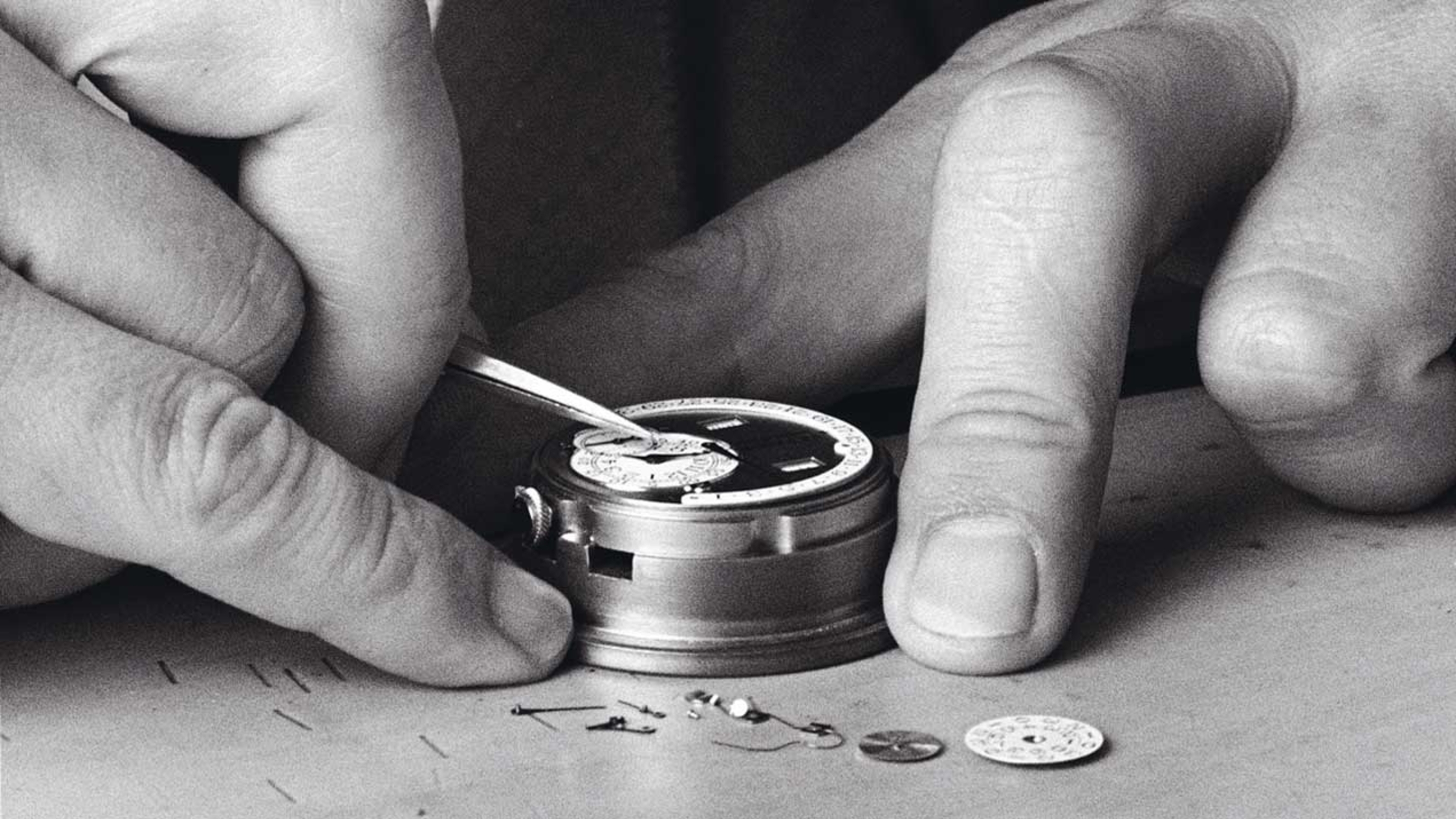
We often say it: F.P. Journe is a watchmaker like no other. This uniqueness stems above all from his creative process. Unlike most brands and watchmakers, who begin with an existing movement and then design the rest of the watch around it, Journe does exactly the opposite: everything starts with the dial. The dial dictates the architecture of the movement, in a continuous dialogue between aesthetics and mechanics.
This approach is unquestionably more complex, but it has allowed F.P. Journe to push beyond the traditional limits of mechanical watchmaking. Journe refuses to alter the position of an element on the dial simply because it is technically difficult to achieve. If a choice is right from a functional and aesthetic standpoint, he will always find a way to make it work.
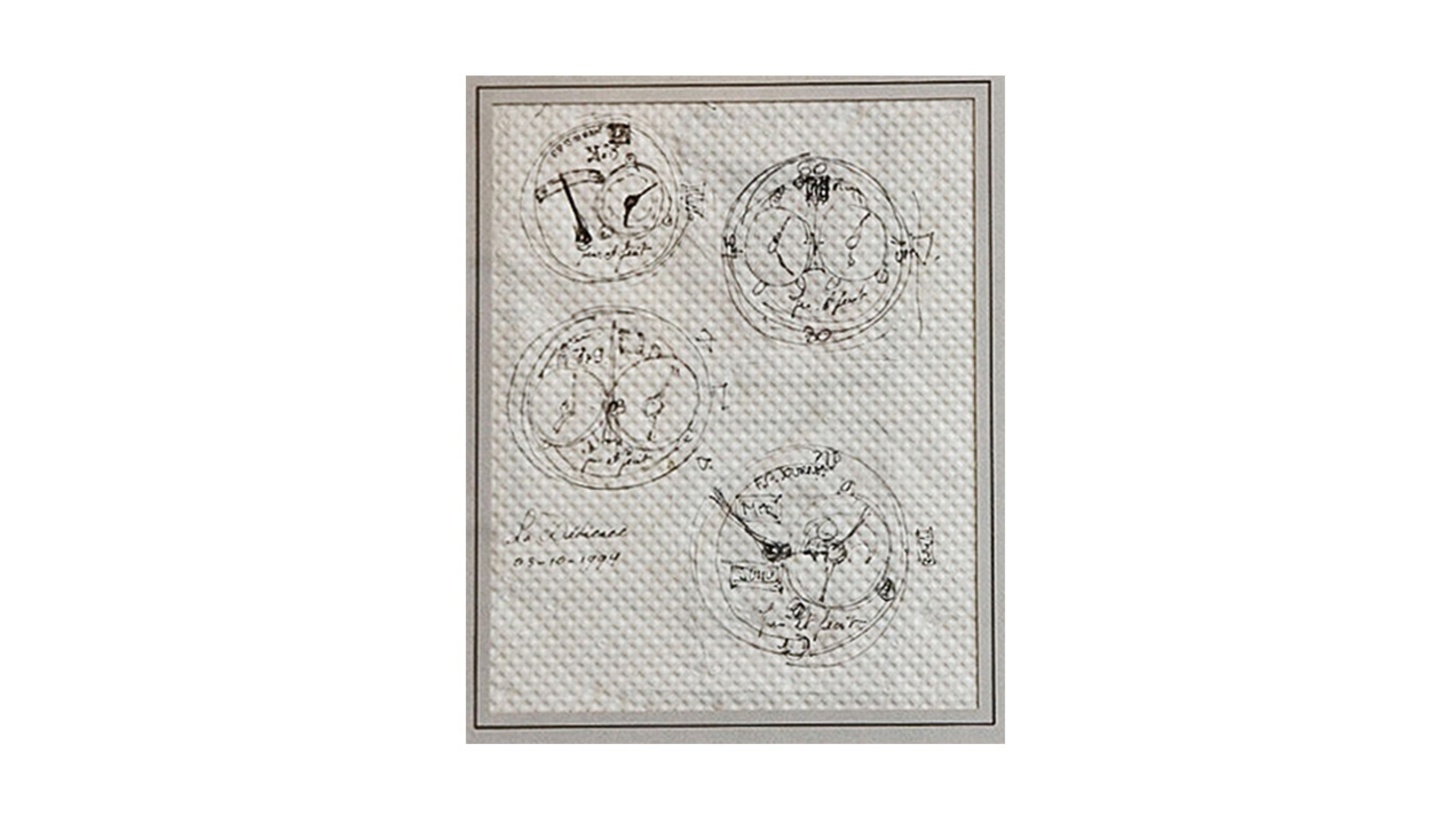
The famous Paris bistro napkin
In the late 1990s, F.P. Journe sketched his first design on a bistro napkin in Paris. That drawing, now framed at the Geneva Manufacture, represents the archetype of the dials found across future Journe collections. Once again, it confirms that for Journe, a true project always begins with the dial.
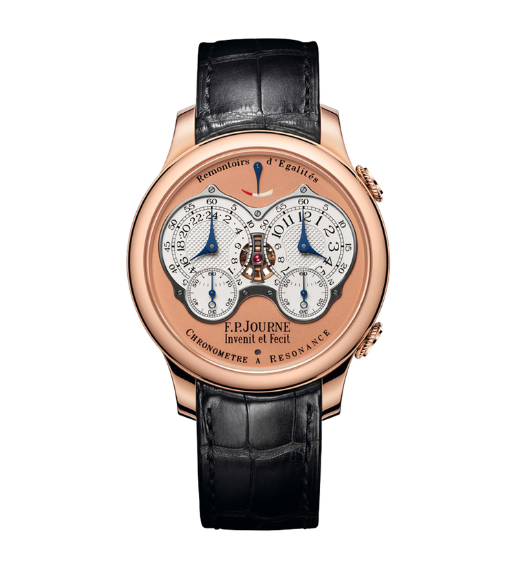
Remaining faithful to those original sketches, Journe designed his first movements with the hours and minutes positioned on the right, on the crown side, and the additional functions or complications on the left. In this way, the essential information, the time, always remains visible, even when the watch is partially covered by a shirt cuff. The non-essential indications reveal themselves only when the dial is viewed in its entirety.
Distinctive aesthetic codes
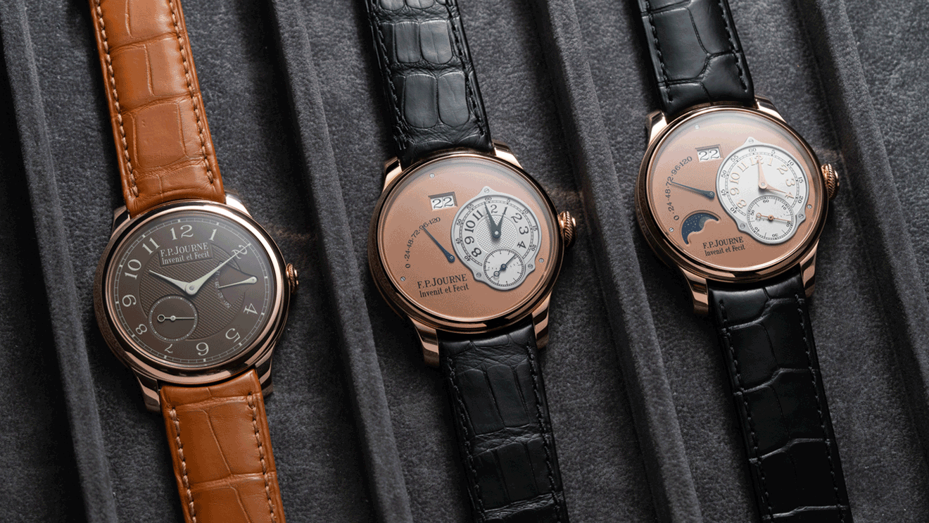
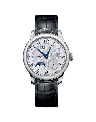
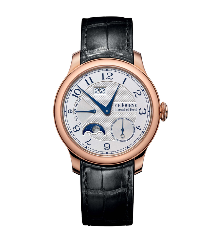
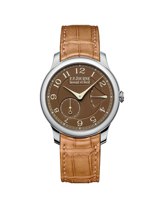
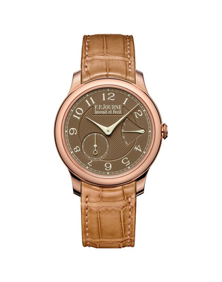
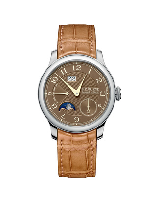
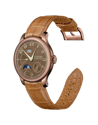
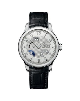
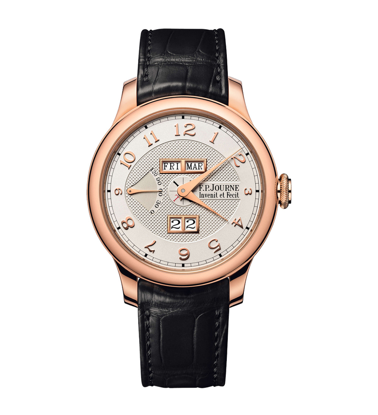
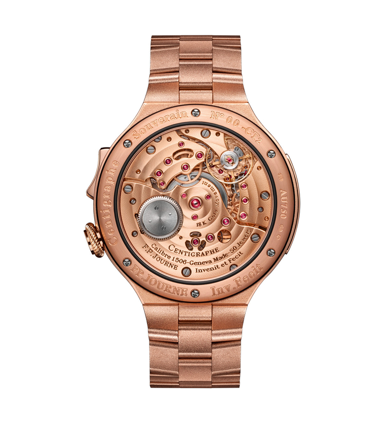
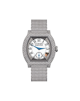
The small silver subdials with guilloché decoration are always enclosed within a steel frame secured by screws. The main dials on which they are mounted are crafted in 6N red gold, white gold, or, on certain models such as the Chronomètre Souverain, silver. Only a handful of very early examples were produced in yellow gold.
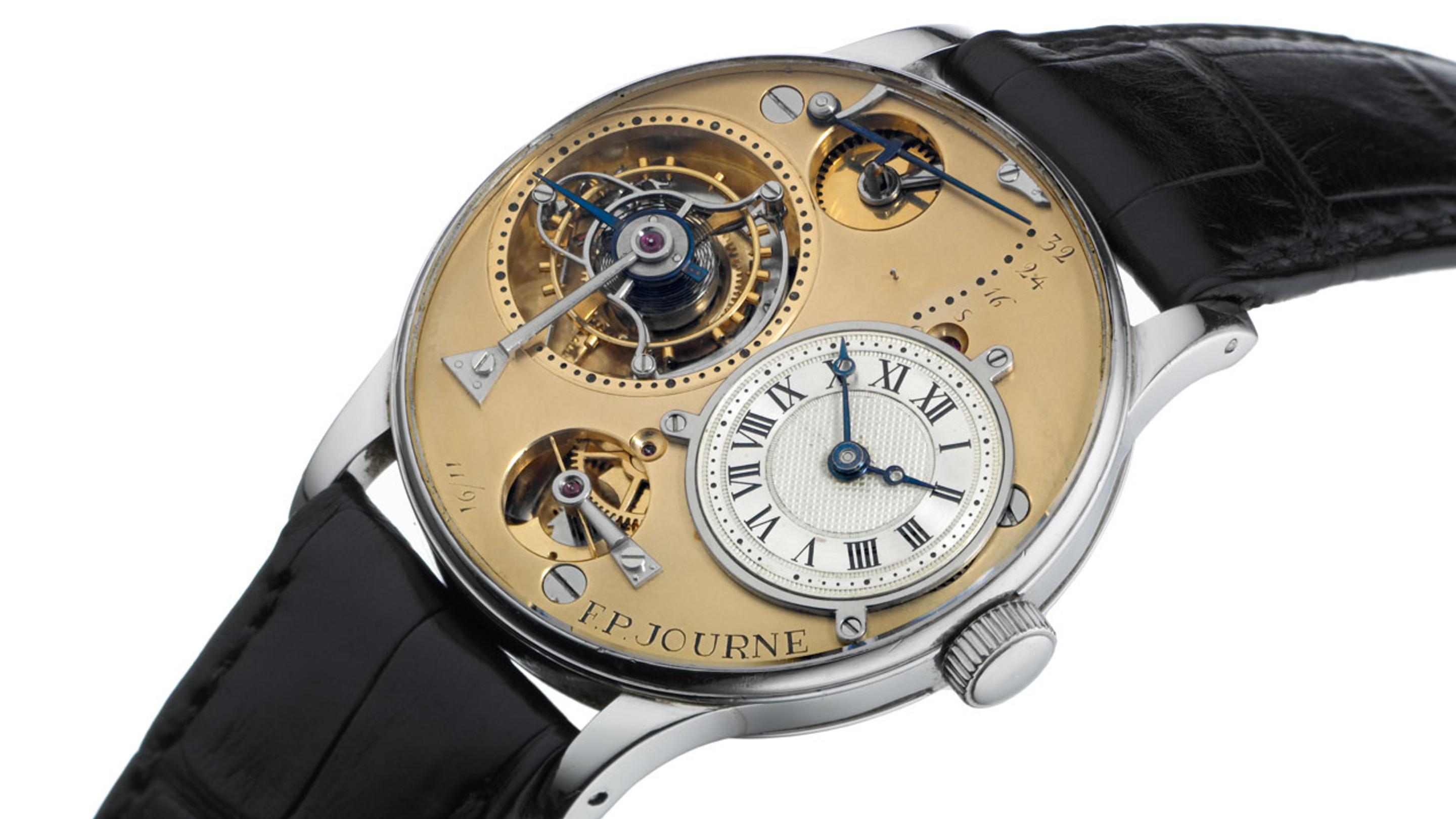
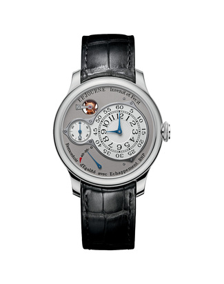
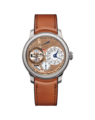
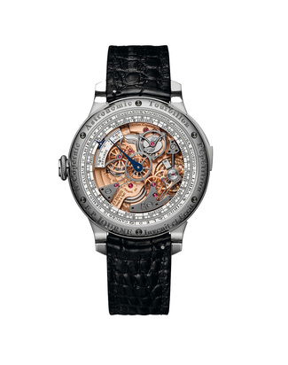
All these aesthetic codes trace their origins to Journe’s earliest inspirations, clearly expressed in his first wristwatch: the prototype of the Tourbillon Souverain 11/91.
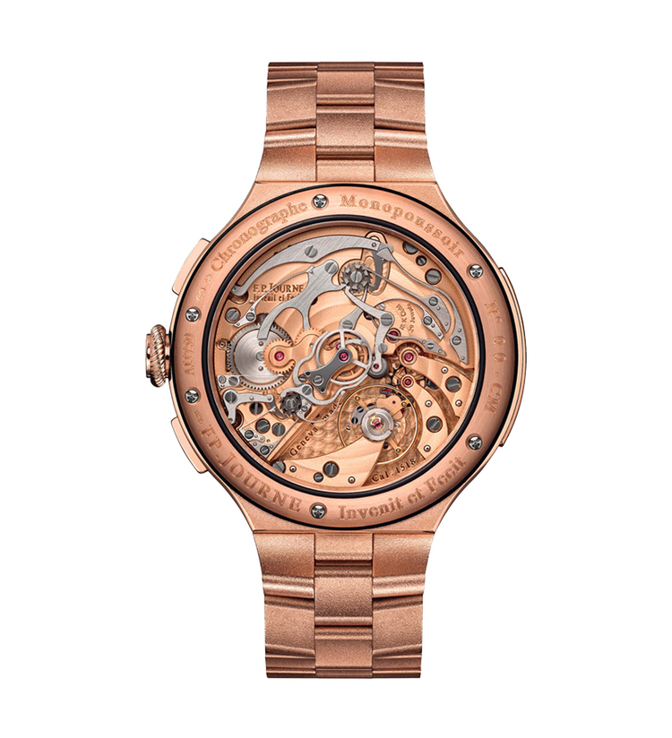
The guilloché dial draws inspiration from Breguet’s work, as do the iconic pomme hands. The dial is screwed directly onto the plate, just as scientific instruments were constructed in Ferdinand Berthoud’s era: a pure tool, functional and free of superfluous embellishment. Completing the picture are the Remontoir d’égalité, the true Holy Grail of watchmaking, and the Tourbillon, another reference to Breguet. The lyre-shaped cage pays tribute to Ernest Guinand, the watchmaker who recreated the first tourbillons at the end of the 19th century.
The result is an aesthetic that was entirely unique by the late 1990s, there was nothing like it in the watchmaking world.
From off-centered dials to central hands
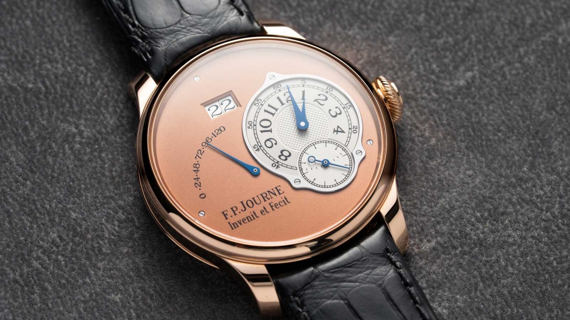
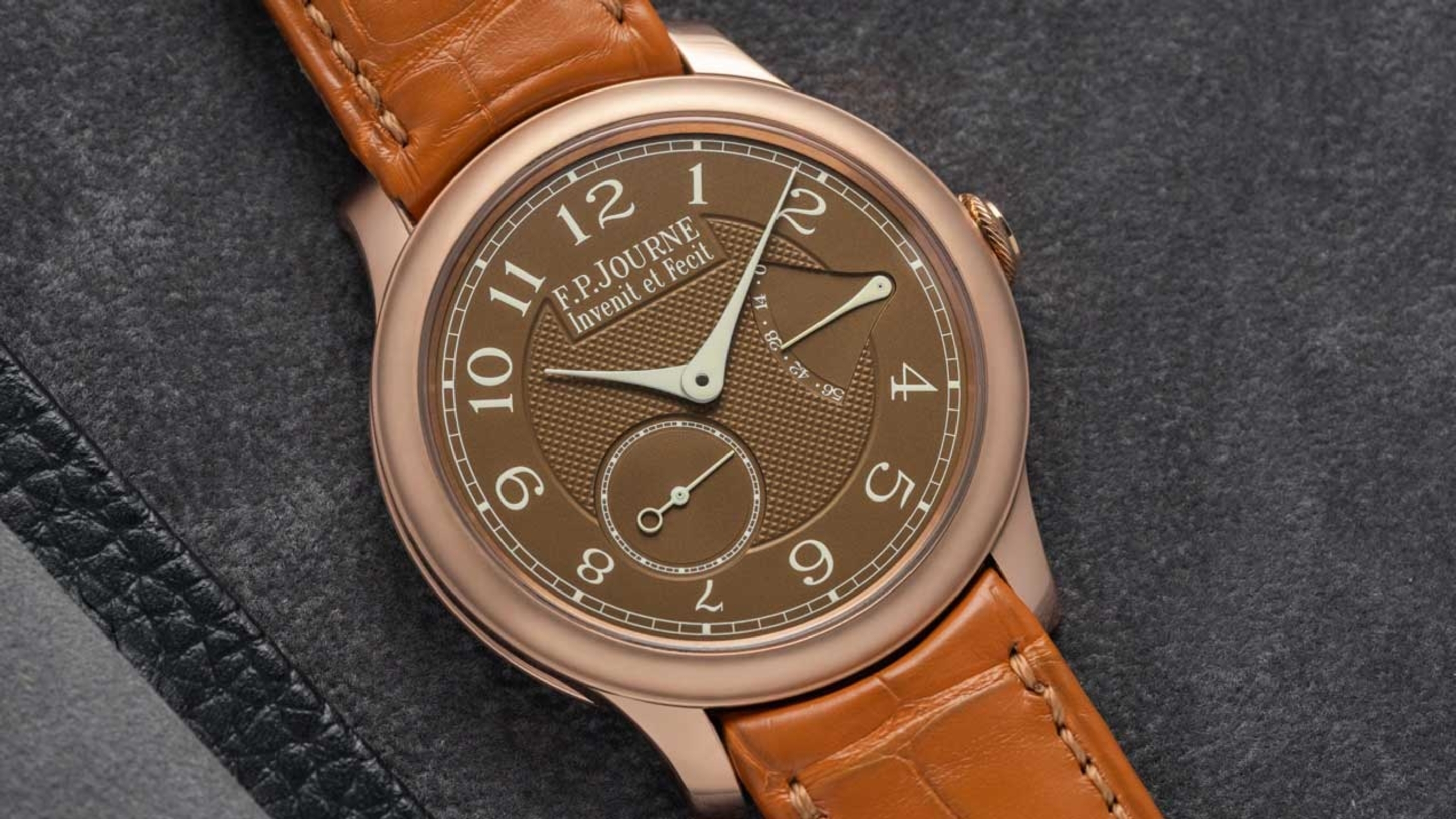
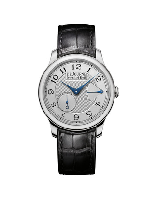
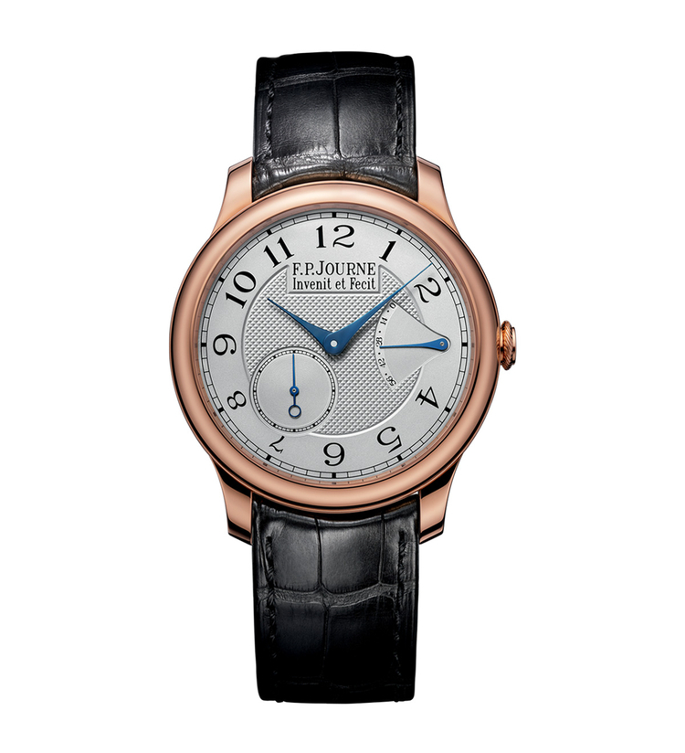
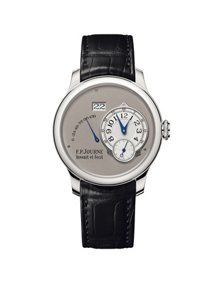
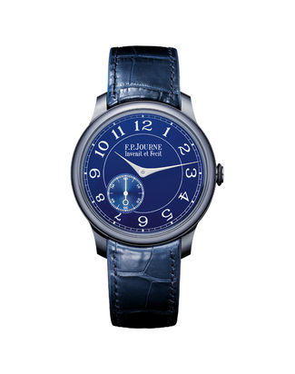
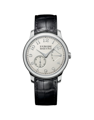
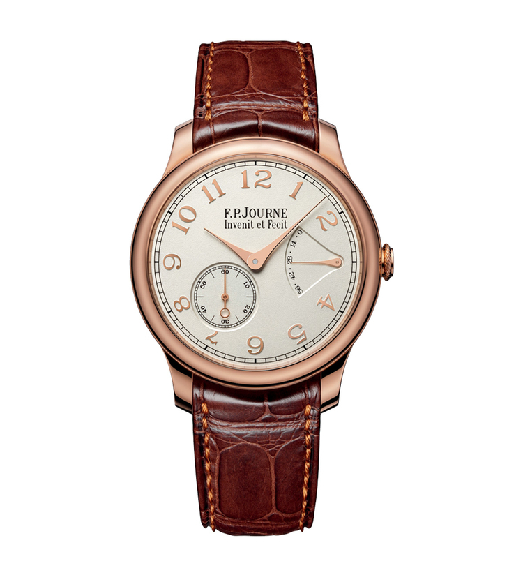
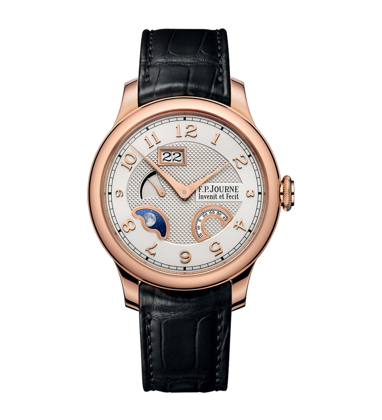
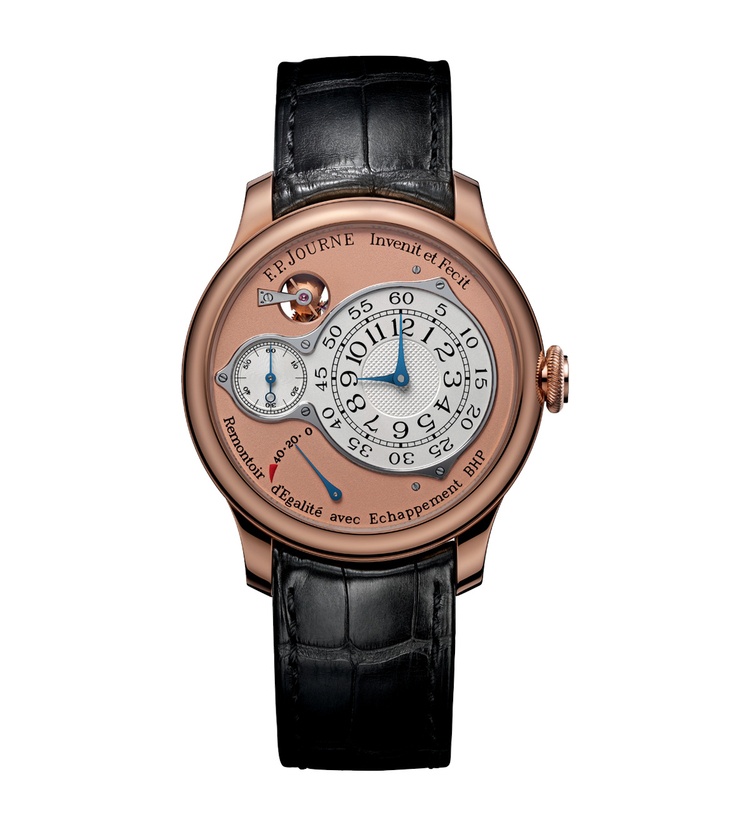
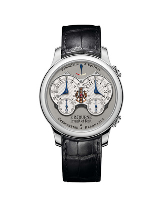
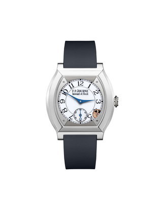
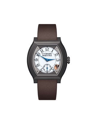
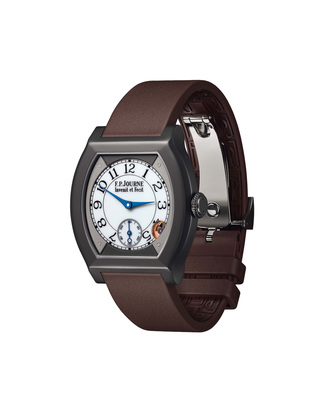
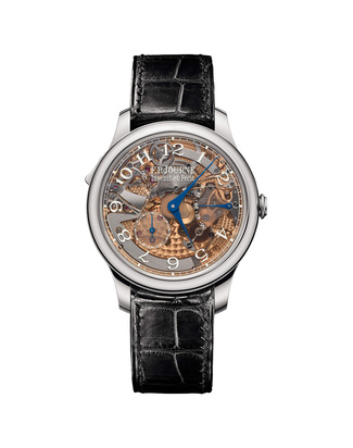
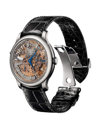
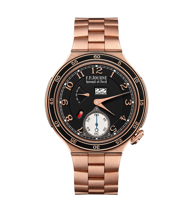
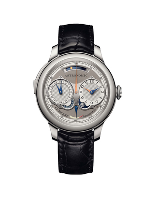
All early models: the Tourbillon Souverain in 1999, the Chronomètre à Résonance in 2000, the Octa Réserve de Marche in 2001, and many others, featured off-centered dials. It was not until 2005 that F.P. Journe introduced its first watch with central hands: the Chronomètre Souverain.
One particularly emblematic detail is the power reserve indicator, positioned on the right side of the dial at 3 o’clock. A choice no one else had dared to make, as the winding and time-setting system linked to the crown lies directly beneath that area.
On the Chronomètre Souverain, this configuration is made possible by a system developed specifically by François-Paul Journe for this model. The mechanism is designed to sit beneath the winding and time-setting system on the crown side, using a very low-friction transmission and achieving a total height of just 0.5 mm. Once again, design dictated the mechanics, not the other way around. Invenit et Fecit.
The art of the dial, according to Journe
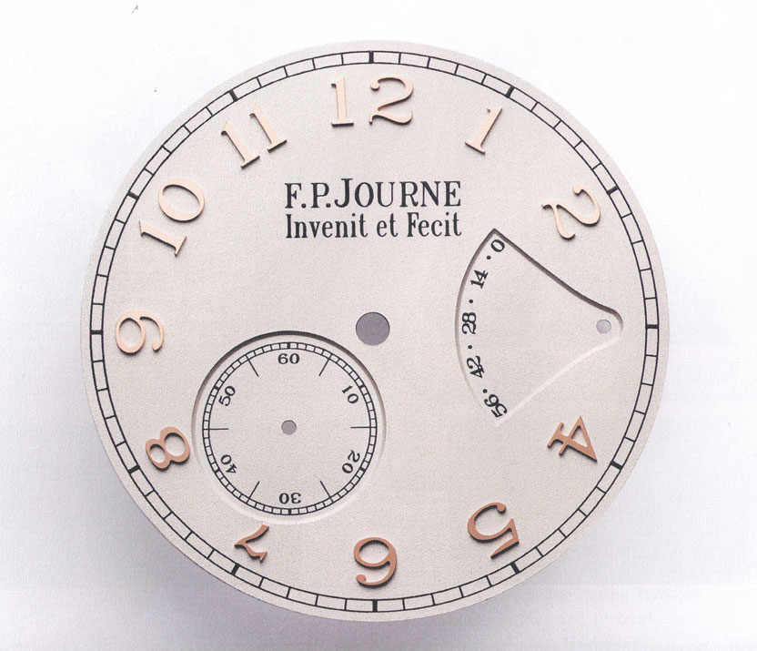
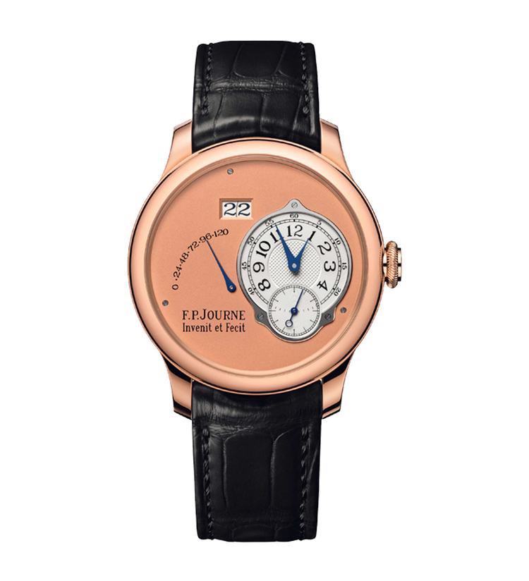
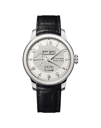
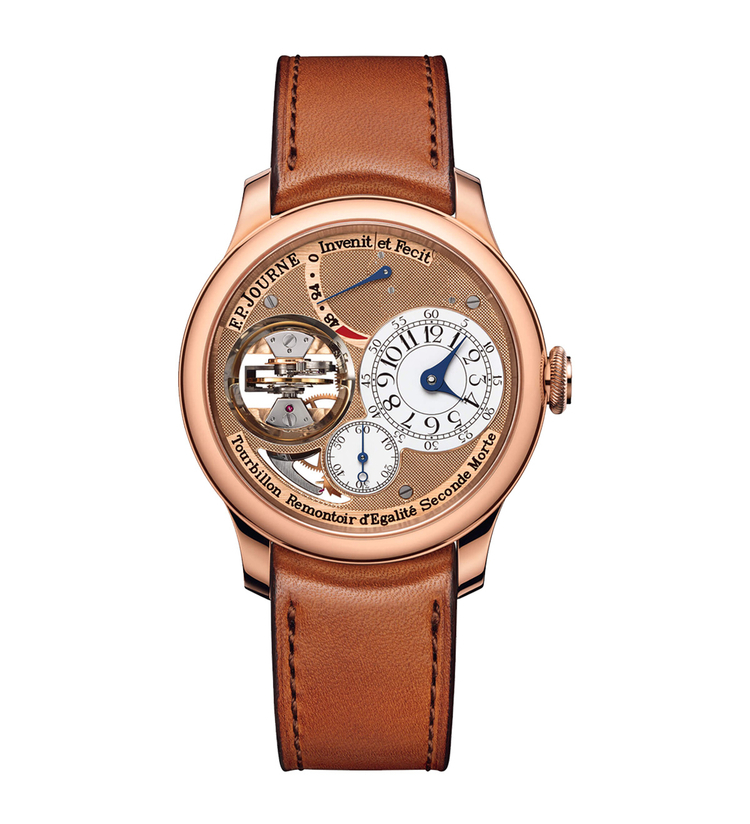
The dial of the Chronomètre Souverain is a silver plate finished with clous de Paris guilloché. F.P. Journe has often stated that guilloché is his favorite dial finish, as it reminds him of the watches he loved as a child. This decoration has been present on the silver subdials of his watches ever since the very first Tourbillon in 1999.
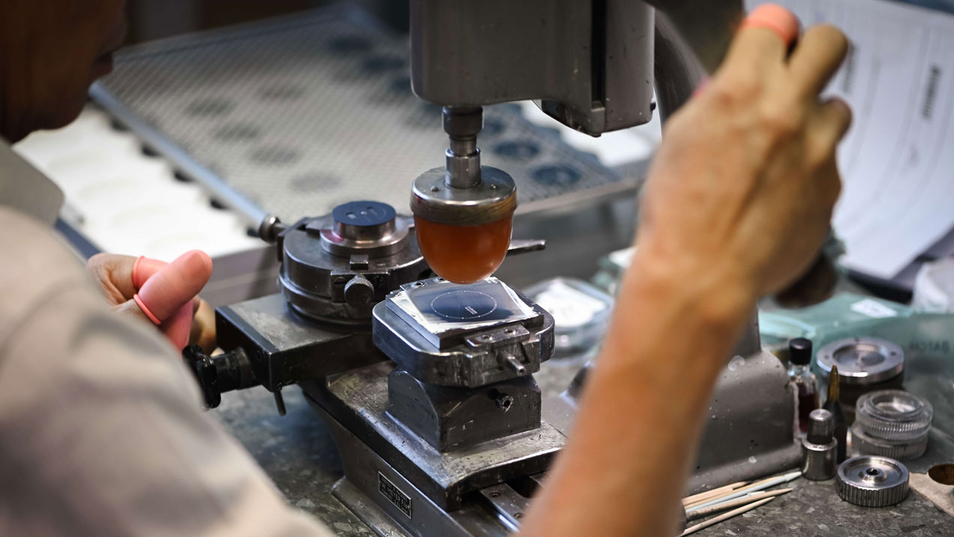
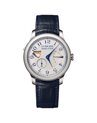
Traditionally, the Arabic numerals are applied by hand using a silicone pad dipped in glossy black ink, a rare and extremely delicate technique mastered within Journe’s own dial workshop, Les Cadraniers de Genève. In recent years, however, the use of applied gold numerals has been progressively adopted across the collection, as seen on the Chronomètre Souverain with blue dial, reflecting a stylistic evolution fully consistent with the Maison’s historical codes.
A closer look at the numerals reveals a subtle yet remarkable detail: they are not all the same size. Their dimensions vary according to their position on the dial, a refined visual device that creates harmony on an asymmetrical layout and avoids the need to truncate numerals near the subdials.
A total aesthetic vision
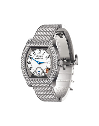
F.P. Journe goes beyond the mere design of dials and movements, creating a distinctive style even for numerals and hands, so distinctive that they bear his name. The cases are exceptionally harmonious, as is the winding crown, specifically designed with carefully considered knurling to provide optimal grip.
For Journe, a watch must be visually perfect, not merely mechanically flawless. It is this total vision, coherent, rigorous, and deeply personal, that makes F.P. Journe a unique figure in modern watchmaking.


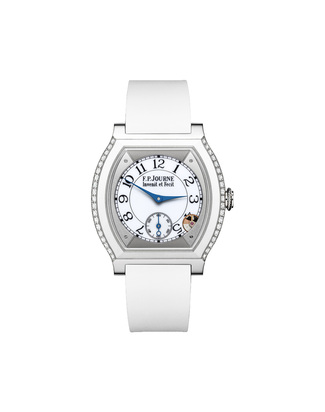
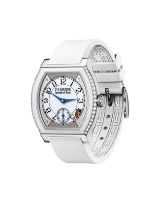
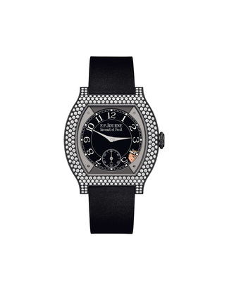
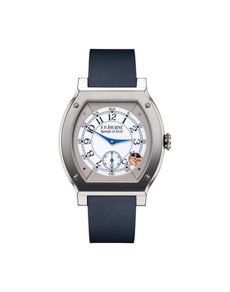
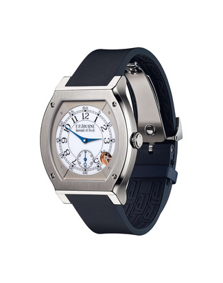
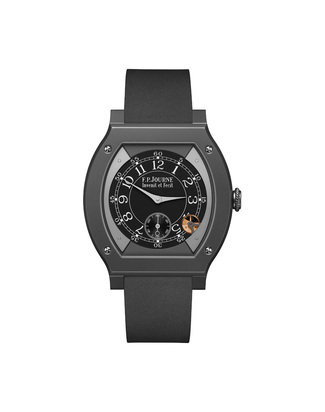
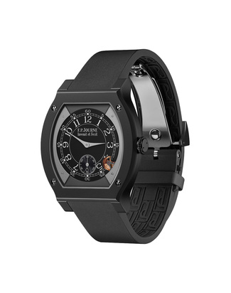
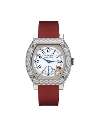
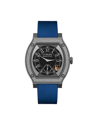
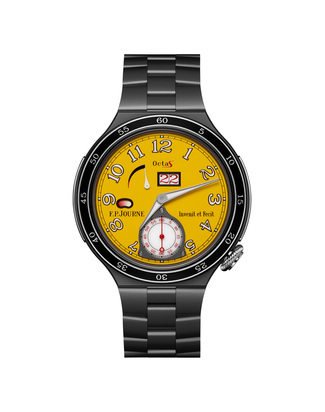
This article discusses these watches:


Related articles:
 News and trends
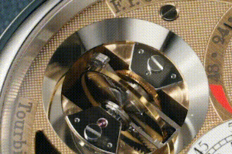 Reviews
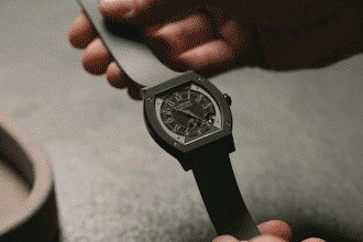 News and trends
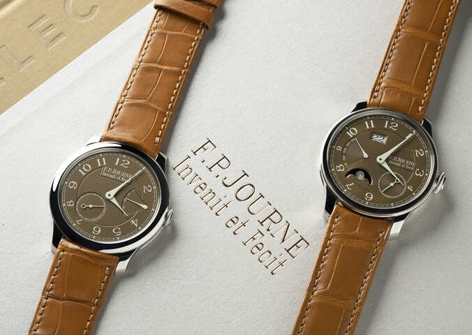 Reviews
 Reviews
 Reviews
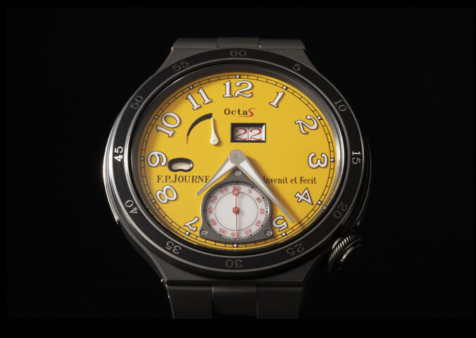 Reviews
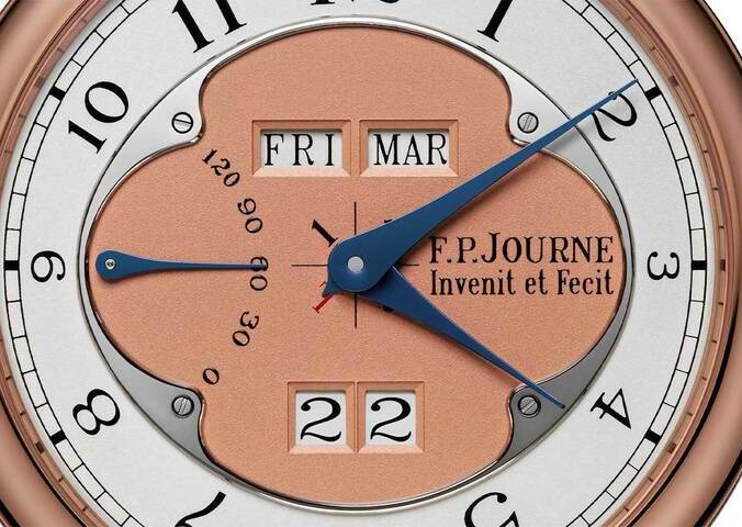 Stories
 Stories
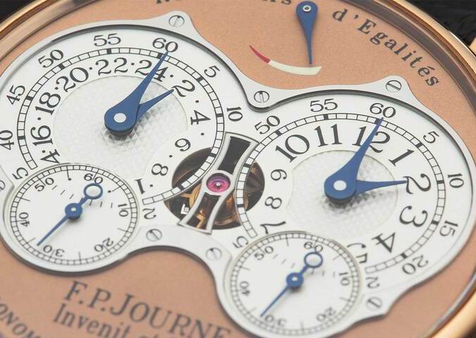 Guide
Guide Stories
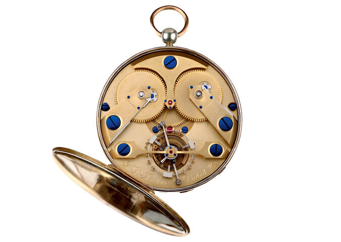 Stories
Keep up to date. Subscribe to our newsletter.
